Data Visualization for Nonprofits: Showcasing Impact with Clarity

A bar chart sits front and center on a periwinkle background. Surrounding the bar chart are golden pie charts.
February 28, 2025
6 minutes
This article is part of a series
Keep learning with related articles.
Soon..

Impactful visualization techniques transform raw numbers into visuals like charts, graphs, and maps, helping nonprofits communicate complex information quickly and effectively. For fundraisers and executives, it’s a bridge between data and storytelling—turning metrics into actionable insights that inspire donors and drive decisions.

Why Nonprofit Data Visualization Matters

Improves stakeholder engagement

Donors, board members, and grantmakers often skim reports. Visuals like progress bars or heatmaps grab attention and make outcomes memorable. For example, a timeline showing donor growth pre- and post-campaign helps supporters see their collective impact.

Simplifies decision-making

Trends hidden in spreadsheets become obvious in visuals. A line graph could reveal a 40% drop in recurring gifts during summer, prompting targeted retention efforts.

Practical Applications for Nonprofits: Turning Data into Action

Nonprofit data visualization isn’t just about creating pretty charts—it’s about solving problems and driving decisions. Here’s how nonprofits can apply these advanced visualization tools effectively:

  1. Maps for geographic insights
  2. Infographics for storytelling
  3. Dashboards for real-time monitoring

1. Maps for geographic insights

Maps help identify where your programs excel and where gaps exist. For example:

  • Resource allocation: Overlay service areas with census data (poverty rates) to prioritize communities needing urgent support.
  • Program expansion: Track volunteer density across regions using heatmaps. If rural areas show low engagement, consider mobile outreach.
  • Grant reporting: Show funders a before-and-after map of a reforestation project, highlighting acres restored over time.

2. Infographics for storytelling

Infographics turn abstract numbers into relatable narratives. Structure them to:

  • Highlight urgency: Start with a problem (“1 in 5 local students lacks school supplies”).
  • Show action: Use icons or timelines to outline your intervention (“500 backpacks distributed in August”).
  • Prove impact: Pair stats with photos of students holding supplies.

3. Dashboards for real-time monitoring

Dashboards centralize critical metrics, reducing guesswork.

  • Fundraising performance: Track daily donation totals, average gift size, and campaign ROI. Set alerts for sudden drops.
  • Donor segmentation: Filter dashboards to compare recurring vs. one-time donors, or see matching gift eligibility rates.
  • Program outcomes: Monitor cost-per-impact metrics.

Pro Tip: Customize dashboards with drag-and-drop widgets, like:

  • A progress bar for year-end goals.
  • A line graph showing volunteer sign-ups post-email campaign.
  • A table sorting donors by lifetime value.

Compelling data visualization answers “So what?” for your audience. Maps guide resource decisions, infographics make impact tangible, and dashboards empower real-time adjustments. With powerful tools like Funraise’s Fundraising Intelligence, nonprofits can automate these processes—turning raw data into stories that inspire action.

Best Practices for Effective Visuals

  • Keep it simple: Remove clutter. Use one chart per key message—like a bar graph comparing campaign performance.
  • Leverage color strategically: Highlight critical data but stick to brand colors for consistency. Avoid overwhelming rainbows.
  • Prioritize accessibility: Add alt text to images, use high-contrast colors, and provide text summaries for screen readers.

Nonprofit Data Visualization Tools to Elevate Your Visuals

Funraise’s Fundraising Intelligence

Fundraising Intelligence is, bar none, the best reporting and dashboard tool available for nonprofits. Backing this initiative is Funraise’s continued partnership with Sisense, the leader in AI-driven fundraising analytics software that empowers enterprises to seamlessly transform their data into a competitive edge. Because Funraise exclusively serves the nonprofit sector, this partnership provides Sisense with greatly-increased impact in the social good sector.

Justin Wheeler, Funraise CEO and Co-founder, says, “Funraise has seen firsthand how the power of data intelligence can sustain and accelerate life-changing impact. We’re excited to increase the accessibility of this technology because we know nonprofits are poised to launch into a future where actionable insights will increase impact in a big way.”

Emerging technology

Automate impact reports with drag-and-drop nonprofit dashboard guides, custom metrics, and integrations with nonprofit data visualization tools like Google Data Studio. Track donor demographics or campaign ROI in seconds using AI-powered tools that suggest optimal chart types for your data, while interactive visuals let stakeholders filter results by date or program.

Practically every design and presentation tool these days offers ✨magical AI✨ that can build you gorgeous infographics and charts—even memes! But there aren't so many tech tools that can tell you what the numbers mean. This is where Fundraising Intelligence really becomes your BFF: it pulls the data, exports it automatically, sends it to your stakeholders on a schedule, and delivers delightfully clear, accessible visual representations of your impact.

Measuring and Sharing Impact

Understanding and communicating your nonprofit organization's impact requires more than just tracking numbers—it demands strategic analysis and storytelling that resonates. Here’s how to refine your approach:

  1. Choosing the right metrics
  2. Turning data into action
  3. Communicating with stakeholders

1. Choosing the right metrics

Focus on KPIs that align with your mission and donor priorities:

  • Donor retention rate: Track how many supporters give year-over-year. A high retention rate signals strong engagement and trust.
  • Cost-per-outcome: Calculate expenses tied to specific results ($50 per student enrolled in tutoring). This metric links spending directly to impact, which grantmakers and major donors prioritize.
  • Program reach: Measure participation (alongside geographic or demographic data to identify gaps or successes.

Why it matters: These metrics help you allocate resources wisely. For example, if retention drops among $100+ donors, you might refine stewardship for this group.

2. Turning data into action

  • A/B testing: Compare two campaign versions (email subject lines or donation page layouts) using side-by-side visuals. Tools like Funraise’s Fundraising Intelligence auto-track conversion rates, letting you quickly adopt what works.
  • Segment analysis: Break data into groups (recurring vs. one-time donors, volunteers vs. event attendees). This reveals trends like matching gift eligibility in 35% of corporate donors, prompting targeted outreach.
  • Real-time dashboards: Monitor daily progress toward goals ($25K raised of $50K target). Alerts for sudden drops in gifts or website traffic let you troubleshoot immediately.

Pro tip: Schedule quarterly reviews to assess trends. A spike in summer donations? Plan a mid-year campaign.

3. Communicating with stakeholders

  • Donor impact reports: Pair stats with stories. Example:
    • "Your $1,200 provided 60 meals (data) to families like Maria’s, who shared: ‘This program helped me return to school’ (story)."
    • Use interactive charts in emails or social posts—let donors toggle between metrics like total meals served and volunteer hours logged.
  • Board updates: Simplify complex data with visuals like heatmaps showing regional program growth or bar graphs comparing year-over-year fundraising.
  • Public transparency: Share bite-sized wins on social media ("Thanks to you, 85% of our students graduated this year!") with a progress bar toward next year’s goal.

Accessibility note: Add alt text to images, use screen-reader-friendly formats, and avoid jargon like “ROI” without explanation ("For every $1 donated, we provide $5 in services").

Ready to Make Data Work Harder?

Data visualization strategies aren't just about aesthetics—it’s about clarity, efficiency, and trust. With tools like Funraise’s Fundraising Intelligence, you can turn insights into action and prove your impact without drowning in spreadsheets.

Mobile phone with donation form and donation charts floating around the phone.Mobile phone with donation form and donation charts floating around the phone.Woman looking at fundraising chart with button to book a call.Yellow shapes in background with donation form in front with stylized text, build an intelligence giving experience.Sparkling star.
Download
Sparkling star.
Start For Free
Sparkling star.Sparkling stars.
Blue shapes.Blue shapes.Blue shapes.

Fundraising Data Visualization FAQ

How do nonprofits use data analytics?

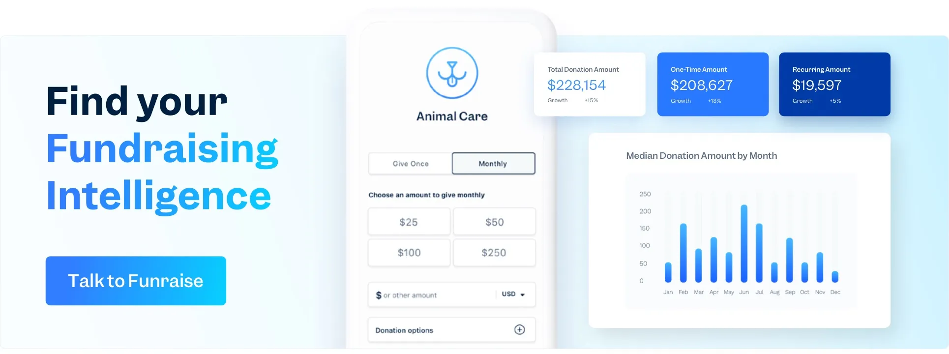
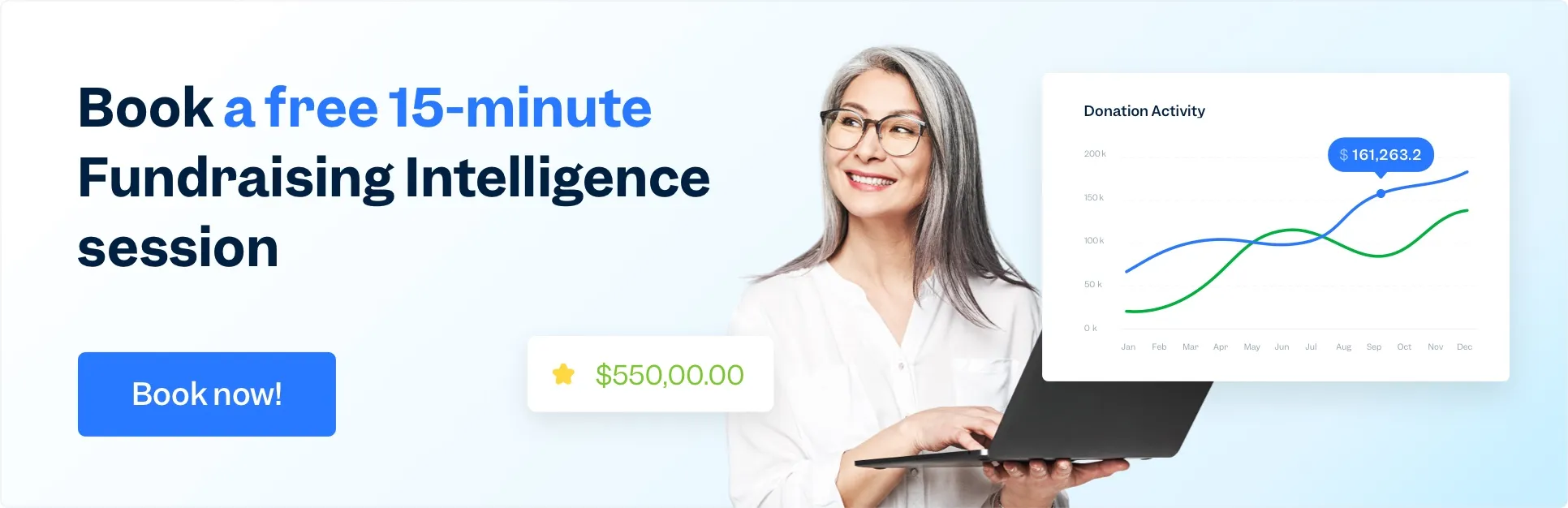
Nonprofits use data analytics to track donation trends, measure campaign success, and identify donor retention patterns. Funraise’s Fundraising Intelligence brings home the importance of data for nonprofits with automated reports on metrics like gift frequency, matching gift eligibility, and program-specific ROI, helping teams allocate resources effectively and demonstrate impact.

Which data visualization tool should you choose?

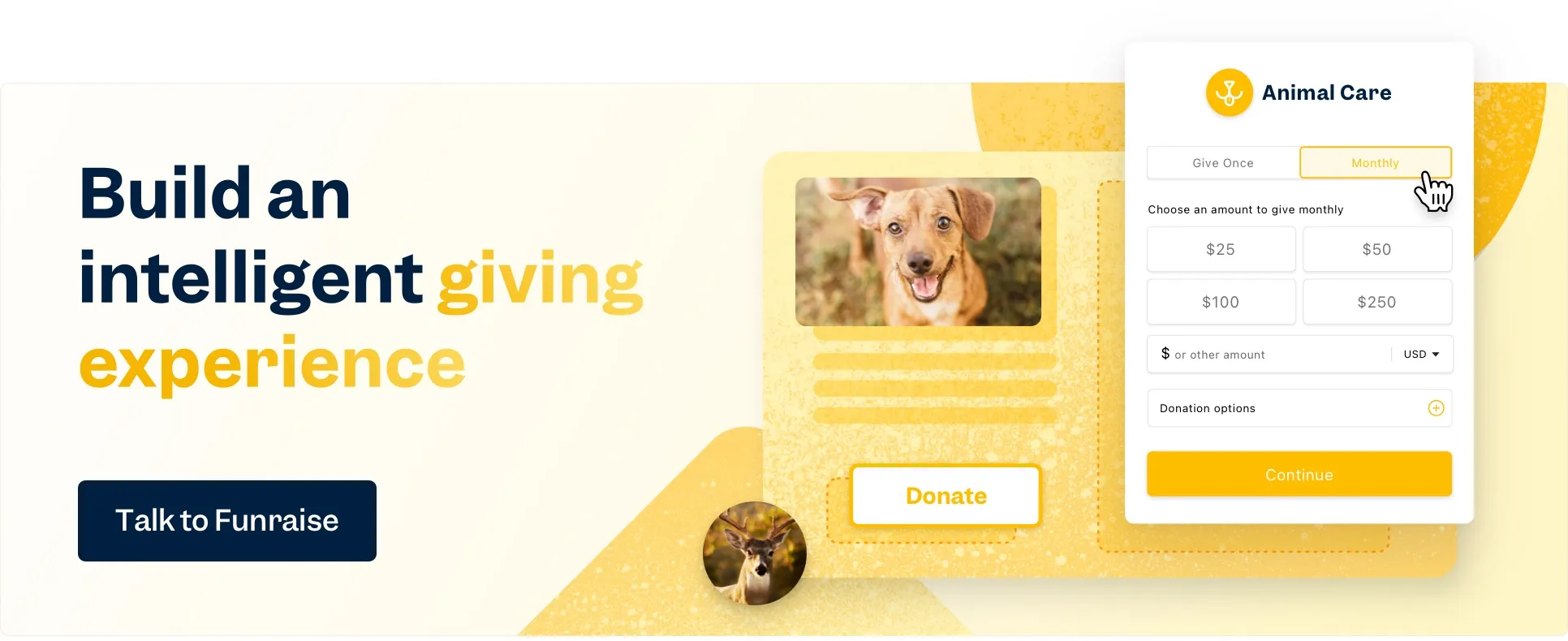
Opt for tools that integrate with your donor data and offer nonprofit-specific templates. Funraise’s Fundraising Intelligence includes pre-built dashboards, real-time metrics, and drag-and-drop customization, ensuring you spend less time formatting and more time analyzing trends like recurring donor growth or event revenue.

What are nonprofit data visualization tools?

These tools transform raw data into visuals like charts, maps, or dashboards. Funraise’s platform auto-generates interactive reports (e.g., donor heatmaps or campaign progress bars), making it easy to share outcomes with stakeholders without manual data crunching.

Which kind of chart should you use?

Use bar charts to compare campaign performance, line graphs for donation trends over time, and pie charts to show fund allocation. Funraise’s Fundraising Intelligence suggests types of charts based on your data, like a progress thermometer for fundraising goals or a heatmap for regional engagement.

Which type of infographic should you use?

Infographics are ultimately tools to help you make informed decisions. For example, custom infographics with can provide uncommon insights, while statistical infographics can help contextualize impact. Choose impact timelines (showing milestones achieved with donor support) or program breakdowns (linking donations to outcomes).

Funraise provides branded templates that auto-populate data, ensuring visuals align with your mission and resonate with supporters. Within your infographic, you can use a variety of simple charts, like simple bar charts, bullet charts, and common charts like combo charts.

In this Article