“It was the single biggest contribution to our successful revenue gains in 2020.”
This is Andrew Chappell, Digital Lead for Action Against Hunger, talking about the value resulting from adding Funraise's pop-up donation forms to their website.
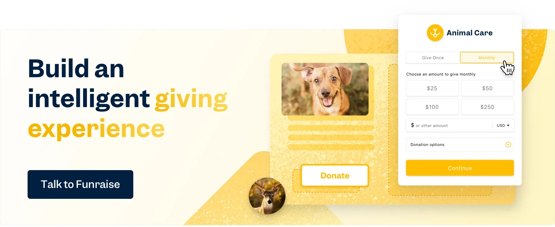
The effects Action Against Hunger is seeing are the result of a long conversion rate optimization test comparing donation pages with pop-up donation forms—one of many experiments that Action Against Hunger regularly performs to ensure that they're providing the best giving experience for their donors.
Andrew has more tips for nonprofits that are ready to increase donations and are looking for innovative ways to improve conversions—like you! Read below for expert guidance and examples based on Andrew's Nonstop Nonprofit podcast conversation with Funraise CEO and Co-founder Justin Wheeler.
Tip #1
Stop siloing marketing and fundraising
Marketing is fundraising. Fundraising is marketing.
To increase brand awareness, gain donors, and expand your reach, you've gotta change your mindset and view marketing and fundraising as a unit.
Tip #2
When it comes to digital, base your budget on your goals
These days, going digital is a necessity. And with the ability to track ad clicks and conversions all the way to the donation confirmation, you can—and should!—make sure your digital strategy and budget work toward ensuring specific audience activity, like reading your nonprofit's story, watching a video of your work, downloading an impact report, liking a social media post, sharing a social media post, clicking through an ad, and, yes, making a donation!
Tip #3
Look at every page as a donation page
Nonprofits often have one central donation page where they send potential givers. Ironically, the process of getting to that page can distract donors from their purpose: giving. So... don't get in their way! When you make use of a pop-up donation form, you're not getting in the way of that compulsion to give that your videos, stories, and images invoke in your website visitors, and you're ensuring every page is a donation page.
Tip #4
Get all the gears of your fundraising campaign turning together
Your audience targeting, your campaign's creative (words, images, videos, and more), and your landing pages all need to work together for any of them to be successful. Look to your metrics to tell you where you can do better; for example, if you're seeing high engagement on social but low conversions, work on your landing page.
Targeting
The Chick Mission's Race Like A Girl campaign is highly targeted and focused on engaging prospective donors who have the potential to turn into long-term, multi-faceted fundraisers and advocates.

Creative
The originality and celebratory nature of the Birthday Party Project's creative pulls in everyone from the mildly curious to potential donors to sponsors.

Landing Page
Conversions can always be higher. Take note of how the big dogs, like Innocence Project, set up their landing pages and when you follow suit, keep track of your tests so you can back up your awesome success with awesome numbers.

Tip #5
Know your audience's behavior
Don't just look at targets and metrics, seek to understand your donors' worth, their spending habits, mobile behavior, giving behavior, time of giving, durability as donors, and any other info you can snag.
Tip #6
Reduce costs
When you've got your donors' worth, cost, and lifetime value, don't stop at optimizing the experience from the donor side. Take the time to find ways to optimize everything you're putting into fundraising, including your budget. Your path forward is through innovative ways to maximize your ROI. Take Funraise as an example—forward-thinking, big-picture solutions that result in more revenue with lower costs.
Funraise has all the tools you need to take these gamechanging tips and flip your flow. For free.


.webp)
.webp)


.webp)
.webp)

.webp)
.webp)
.webp)


