


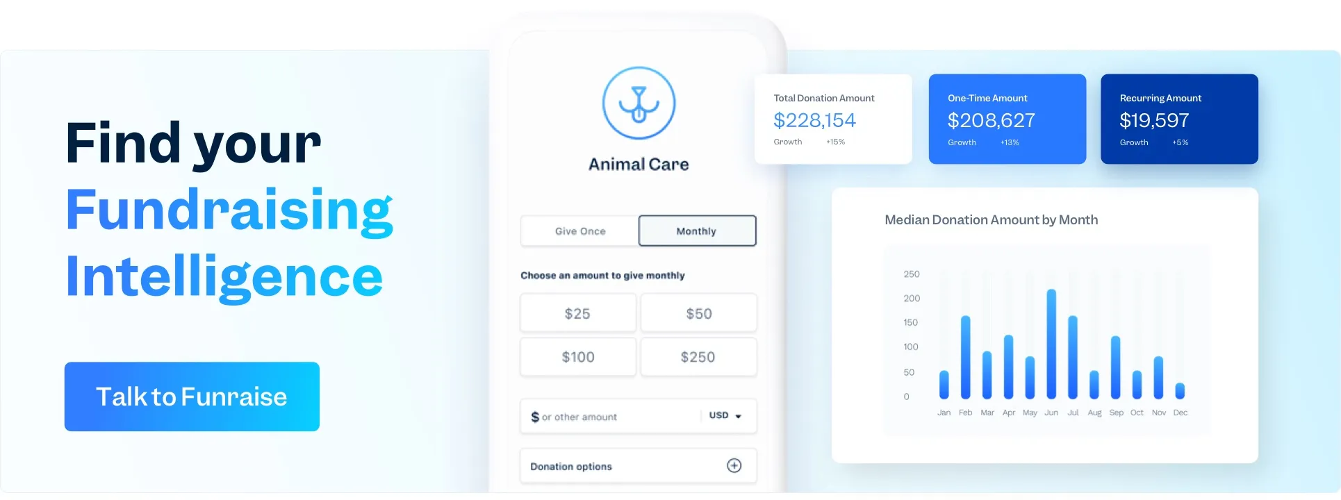
According M+R's Benchmarks, in 2021, the sector average conversion rate for donation pages is 17%. Do you know how your nonprofit's donation page stacks up to that?
Here's a hint: Funraise's donation form has a donation conversion rate of 50%.
Recently, Funraise favorite Mallory Erickson, executive coach, fundraising consultant, and podcast host, provided perspective on how storytelling is more than just inspiring words and heart-tugging video; it's everything involved in your giving experience.
A slow-loading donation page says your organization is slow to implement change.
A fundraising site that's not mobile-optimized tells 54% of your website traffic that you're not considering their access.
A donation form that doesn't accept your donors' method of payment makes supporters wonder whether you really want their money.
And if your giving experience checks all the boxes above... well, the story you're showing (not telling) is that your nonprofit is behind the times, difficult to work with, and not interested in creating relationships.
What story is your nonprofit's donation page telling?
Above are our takeaways from Mallory's training. Read on to discover ways your nonprofit's giving experience shows your story, learn how to highlight your values while increasing donor conversions, and draw your own conclusions about showing your story.
What Inspires Donor Behavior
Nonprofits don’t sell a product or service, so they need the story to both sell and stand in as the product. But what makes people take action? Humans take action when three elements come together:
- Motivation
- Ability
- Prompt
Mallory explains that this is a cognitive behavior loop: our beliefs and our thoughts influence our emotions which ultimately influence our actions which impacts the results that we get. When we pile on the barriers to external factors, we disempower ourselves from recognizing the way that our thoughts and our beliefs are impacting the way that we feel.
"Great fundraising is not an ask. It's an offer," says Mallory—and she's right. There's nothing so motivating as having barriers lifted and obstacles removed.
The Effectiveness of a Donor’s Experience
A story uses a narrative to make an emotional connection between your audience and the incredible work that you do. Good stories change our brain by producing two chemical reactions:
- Cortisol focuses our attention on something (distress)
- Oxytocin is responsible for care, connection, and empathy
You’re so focused on the story that you’re telling that you may be ignoring the story you’re showing. Your website and giving experience give way more info to a donor than you think—do they make you look modern, growth-focused, and trustworthy? Or do they paint you as difficult, set in your ways, and distracted?
Think about it, you spend weeks working on your newsletter copy to tell your donors about all of the ways in which you are aligned with their values, you’ve collected testimonials and stories of impact, and the copy is compelling and engaging. You get your highest number of donors ever to click on that button in the email, and then... the donor becomes confused when the clunky website doesn’t feel as warm and inviting as that email did, the branding doesn’t match so they do a double take to make sure it’s the same org. What happened? They felt so seen in the email you sent... but this multi-page donation form is making them feel like you actually don't understand how busy they are.
So you see, it isn’t just your campaign story or your beneficiary's story that has an impact on donation conversions, the flow of the donor’s experience throughout the entire engagement impacts these chemical reactions, too.
Quick Fixes to Raise More
Total time to implement: a quick-as-a-wink 1 hour. (That's for Funraise users, obv.)
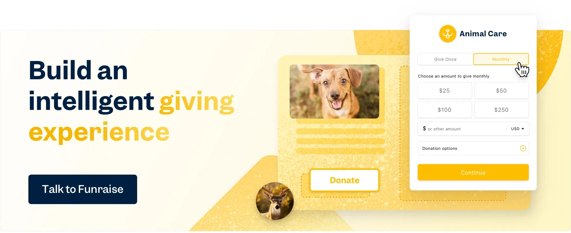
Obvious Donate button in navigation
Your homepage should be your #1 page, traffic-wise. Your donation page should be #2. If it’s not, start by fixing that. First thing… if there’s not a big bright DONATE button in your header navigation (on every single page), make that your first change.
Monthly Giving default
Add a monthly giving button next to your donate button (in your header and on your donation form.) Yeah, recurring giving is a no-brainer to you, but there are people out there who don’t know they can give monthly. Prioritizing recurring is inclusive, shows that you’re interested in long-term relationships with donors, and relays to the donor that monthly giving has high impact.
Ensure messaging is consistent
Emotion should build from first touch through the donation itself and should have a connecting throughline—at the moment of donation, emotion should be at its highest. If you run ads explaining the impact of $50, that information should show on your landing page and be explained on your donation page and should lead to a $50 donate button on the donation form. Use your technology to sell the story that your words and images are telling.
Add a recent donor feed and/or donor testimonials
- If you’re using a Funraise campaign site, you can add a recent donor feed that generates social proof and FOMO—donors are more likely to give if they’re not the first one. A recent donor feed shows that this is a living, breathing campaign.
- If you’re using a Funraise campaign site, add donor testimonials—get a few donors to explain why they give, then add quotes and headshots to your page. You don’t have to be the one telling your story, convincing donors to give. Have your donors do that heavy lifting.
3 Big Strategies That Transform the Donor Experience
If you've got the quick fixes down and are ready for more, Mallory has 3 deeper strategies that you can use to bring consistency, connection, and conversions to your donation page.
1. Map the emotional connection throughout the giving experience
Stimulate curiosity and generate interest by curing donors of their experiential blindness. Keep the giving experience short and sweet, but increase the information you provide on the impact of each donation.
Here's how: Use donation buttons and impact cards to make “impact buttons”. When a donor can learn about the mission and what donations of varying amounts can achieve, it increases trust. The donor takes responsibility for the impact that they’re making through their donation—the donor makes a choice, not a donation. And all of that leads to a long-term relationship between donor and org. Think transformational instead of transactional.
Take your urgency from cringey to relevant. No one wants to be guilted into donating, and if given a reason to walk away from that guilt, who wouldn't take the chance?
Here's how: Make donating a joyous experience to be celebrated. Encourage donors at every step by offering additional opportunities to make a difference, like dedicating their donation, allocating their donation to a program or recipient of their choice, and even appealing to them to cover any processing fees. Ensure that the follow up is congratulatory and emphasize the thread that now binds your nonprofit's impact and the donor.
Finally, quantify the impact of the donation. You've already got impact cards, which give a money-to-impact correlation, but bring it back to the impact of that money, the story behind the school supplies or world hunger or ravaged forests.
Here's how: Donation pages explaining how a donation will be used result in more and higher donations than donation pages that just have a donation form on them, so build in a progress bar that doesn't just show the amount raised, it reveals the number of kids who now have schoolbooks, the amount of families who ate dinner, or the acres of earth restored. Not only will donors see how their donation will be used, they'll also see their donation added to the total amount raised and the total impact.
2. Map out and fix blockers and drop points
A quality giving experience speaks to the quality of your programs. Show donors that your programs are results-focused, prepared, and forward-thinking by anticipating roadblocks and infusing solutions into your website.
The problem: Donors want more information before giving
The solution: Use a pop-up donation form that's accessible from any page of your website. Once donors are satisfied, they can give right there, without having to get back to a special donation page.
The problem: Donors don’t have their credit card in front of them
The solution: Especially with donors on a mobile device, having the ability to donate through a digital wallet, like Apple Pay, is a game-changer. So easy, so simple... and donations through digital wallets are higher on average than other payment methods!
The problem: Donors are unsure of the amount of their donation
The solution: Break it up, recurring donation-style! You would definitely prefer a $10 donation every month over a one-time $50 donation or $50 every month over a one-time $250 donation ...right?
The problem: Donors get distracted and abandon their cart
The solution: Abandoned cart recovery. Remind people of the impact that they're going to make, the donation that they're in the middle of, and the one-two clicks they need to make that impact.
3. Add humanity during and after the process
We're all human. And treating donors like a walking wallet isn't the way to their hearts (or wallets.) So bring your most vulnerable self to the donation process to see where you can ease the process.
Go through the process yourself from an incognito tab to put yourself in your donors' place. Try it on mobile, clicking through an ad or a social media post. Hand over a gift card and have a notoriously critical friend or grumpy family member donate and give you some feedback.
Here are a few things you can do to proactively humanize the process, during and after:
- Personalization when possible
- Add a human tone of voice, even to the error messages
- Customize the confirmation email
- Provide additional information or content on the post-donation landing page
So there you have it! Ways to show your story that shouuuuuld increase conversions. Did you pull some different takeaways? Got additional suggestions? Lay 'em on us!


.webp)
.webp)


.webp)
.webp)
.webp)
.webp)
.webp)


