


Serious question: Why does your nonprofit make it soooo hard to donate on your website?
Every year I make a round of donations to a variety of organizations to see what their giving process is like and what kind of stewardship they provide to donors. And every year I’m surprised to find just how many form fields and clicks it takes to get to the donation confirmation page.
More and more digital donors are making donations on their phones while living their lives. They're multitasking on small screens. That means the minute it gets frustrating is the minute they start thinking about abandoning the donation process.
What’s a nonprofit to do? It’s time to start making your online giving process a whole lot easier for everyone, including you! Yes, you too, fundraiser! After all, managing fundraising tools and trying to get everything to work as it should is probably taking up more of your time than you realize.
Let’s talk about some proven ways to make it easy peasy for your donors to give and how to optimize your online donation forms.
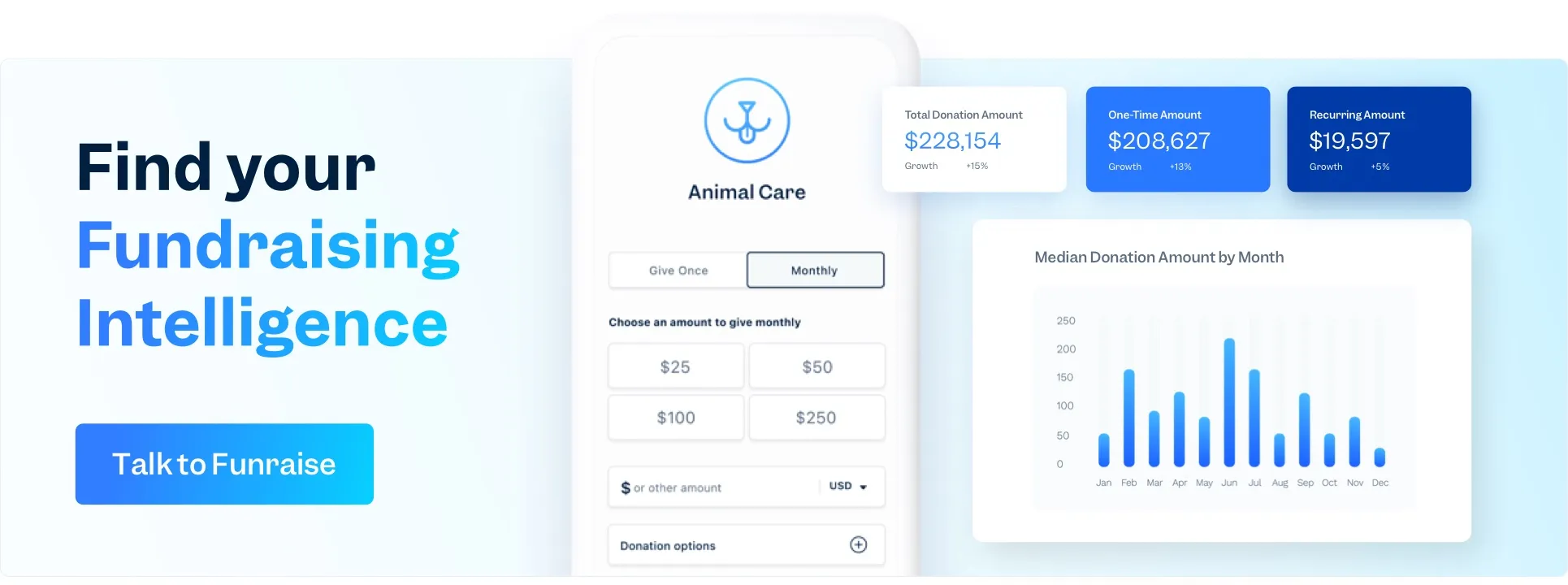
Online donation forms matter a whole lot
Let’s start with some key facts about your online donation form, the home base through which the vast majority of your online donations come. You may have one central page linked to the main donate button on your website. Maybe you have campaign-specific donation pages or even campaign sites. These are great because online giving continues to increase every year.
According to M+R Benchmarks, overall online revenue increased by 10% in 2019. (To boast a little bit, Funraise customer Safe Families saw online giving revenue increase by 583% in 2020, their first year with Funraise.)
It’s encouraging to know that online giving can be a growing source of revenue for your nonprofit and it pays to know the metrics that contribute to your online fundraising success. One metric you’ll want to know is your conversion rate: the number of website visitors you convert to donors. M+R Benchmarks sites the current average conversion rate as 22%. This is not a terrible conversion rate by any means. But there's room to capture more website traffic as donors and more importantly, we have to wonder what percentage of non-converters leave because donating has become too cumbersome.
Try it yourself: Pull up your website analytics and benchmark yourself. What was your conversion rate average last year? What was it last month?
Evaluate your current online giving process and donation form
If you’re ready to dive into the corners of your online giving process, let’s start with evaluating what it’s currently like.
Step 1: Go to your website home page and navigate to the donation form
- Can you figure out where to donate? How long does it take you?
- Is it one click or more than one click to get to the donation form? If it’s more than one click, add this to your list of updates.
Step 2: Once you get to the donation form…
- What kind of information does your nonprofit ask for in the donation form fields? Essential information only? Additional information that you never really use?
- How many clicks is it to get to the thank you page? Remember, each additional click is an opportunity for a donor to decide not to complete the donation process.
Going through this process yourself (especially if it’s been a while!) will shed some light on how easy or difficult it is to donate to your organization online.
Test your online giving process and donation form in other ways
Being the rockstar fundraiser that you are, you’re not going to stop at evaluating your current online giving process yourself. Nope! You’re going to keep testing it under different conditions AND have other people test it for you. User experience data can be your BFF as you optimize your online giving process and donation form.
Here are a few scenarios and people to test your current online giving process.
- Ask your grandma or a friend to donate
- Donate while you're on public transportation
- If you're running ads... click through one of them and donate
- Set an alarm to wake you in the middle of the night from a dead sleep and donate
- Donate while you're holding a baby or a bowl of hot soup (don't hold both at the same time!)
- Donate through a super old browser
- Use a screen reader to direct you to donate
- Make a short video of yourself donating. If you're not brave enough to post it, the giving experience isn't good enough.
Online donation form best practices
Now that you’ve done some user experience research on your online donation form, let’s get to work optimizing it.
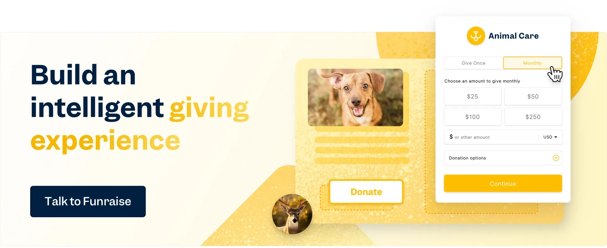
One click to make a donation from the home page
While you were testing your donation process, one of the things you looked at was how many clicks it takes to get to the actual donation form. It should be as few as possible—one. One of the industry best practices is to have a clear donate button on your website.
Action Against Hunger not only has a clear donate button on their homepage and website navigation bar, but it also has a contrasting brand color that’s super easy to spot.

And when you click on the donate button on Action Against Hunger's website, an easy-to-complete form pops up on the site. (Yeah, that's a Funraise form, nbd.) This one change to a pop-up form led to a 78.4% increase in total conversion rates for Action Against Hunger.

Keep Your Branding Consistent
It may not seem like a big deal, but keeping the branding consistent in the online giving process increases donor trust in the process. Ideally, this means keeping donors on your website rather than sending them to a third-party payment processor. When you keep donors on your website, ensuring that you have your logo, brand colors, and other brand elements consistently throughout the payment process experience makes a difference. It also builds trust with your donors.
Here’s an example from One Tail At A Time dog rescue. (Yep, another Funraise form!)

By adding their logo to the donation form and customizing the colors to their brand, One Tail's form consistently represents their organization and increases donor trust in the process.
Choose your gift array wisely
The gift array on your donation form makes a difference. You may see a gift array also referred to as an ask ladder, ask array, or suggested gift amount.
Gift arrays are a uniquely nonprofit thing. After all, your favorite clothing company doesn’t ask you how much you want to pay for a t-shirt. They just give you a price and you don’t negotiate. Too many options can lower conversion rates. Too few options may result in a lower average gift and lower amount raised. Putting huge amounts on your gift array can be a turn-off for smaller dollar donors.
In general, here are some tested best practices for gift arrays:
- Go low to high. Starting with a much larger high amount might signal to donors that your organization values a larger gift than the donor can afford.
- Give donors between 3 and 5 options. When deciding what amounts to include, lean into your donor data to select amounts that reflect average and median gifts.
- Give donors an “other amount” field to enter a custom giving amount.
- Test customizations in the gift array. For example, “$100 provides 1 hour of counseling.” You won’t need to do this for every option on your array, but it's a cool way to test whether providing a tangible connection to a gift amount changes giving behavior.
Ready to dive into more donation form nerdiness?
There’s a whole world out there of online donation form nerdiness for you to test, explore and optimize. (It's called Funraise, hey-o!)
If you’re just getting started, read: Everything Your Nonprofit Needs to Know About Online Donation Forms
Ready to kick it up a notch? check out these 3 epic examples of emails with donation buttons.
Online donation forms are a crucial part of your nonprofit’s digital fundraising program. Don’t overlook this important asset and the (literal!) value it adds to your fundraising program. Work towards a seamless, straightforward user experience for donors and keep optimizing your donation form for maximum conversion rates and high average gift amounts.


.webp)
.webp)


.webp)
.webp)
.webp)
.webp)
.webp)


