


Key takeaways on nonprofit dashboards
- A dashboard is a visual representation of organizational data that allows users to view, track, and analyze key performance indicators (KPIs) and other business metrics to understand how an organization is performing.
- They're important for a nonprofit because they clearly display key trends, help make data-driven decisions, facilitate accountability and transparency, save time and money, and facilitate better communication.
- There are many tool options when it comes to building dashboards, including Google Analytics, Excel, and Microsoft Power BI. Of course, for charities, a nonprofit CMS with data visualization features is the best way to go (and we'd recommend Funraise).
- There are many types of dashboards, with some of the most common types focusing on financial health, program impact, KPIs, donor analytics, and volunteer activities.
Nonprofit KPIs and dashboards FAQ
What are key performance indicators?
Key performance indicators (KPIs) are measurable metrics nonprofits use to track progress toward strategic goals. They quantify impact, optimize resource allocation, and demonstrate accountability to external stakeholders. Essential KPIs include beneficiary reach, donor retention rates, and program effectiveness ratios to drive data-informed decision-making.
What are the best KPIs for nonprofits?
Top nonprofit KPIs include donor conversion rate (financial), program participation metrics (mission impact), volunteer retention rate (operations), and overhead ratio (efficiency). Track fundraising progress, beneficiary outcomes, and social media engagement rates to balance financial health with community impact.
How do you choose the right nonprofit metrics?
Align KPIs with strategic objectives: prioritize mission-critical outcomes like beneficiaries served and program expenses. Use SMART criteria—specific financial indicators or volunteer retention rates. Focus on 8-10 strategic goals across finance, operations, and service delivery to avoid task breakdown.
How do you measure the performance of a nonprofit organization?
Measure performance against goals through financial KPIs (fundraising efficiency, revenue streams), program metrics (participants served, outcome achievement), and operational benchmarks (volunteer management). Combine key drivers like donation growth with qualitative stories of impact for valuable insights into nonprofit management.
What is a nonprofit KPI dashboard?
A nonprofit KPI dashboard centralizes real-time data visualization for long-term goals like donor acquisition costs, program efficiency ratios, and campaign conversion rates. These tools transform raw data into actionable insights, enabling leaders to monitor progress and adjust strategies for financial sustainability, donor engagement, and marketing campaigns.
What should be on a KPI dashboard?
Include donor retention rates, fundraising ROI, program costs per beneficiary, and volunteer engagement metrics. Use powerful tools to prioritize real-time insights, visual charts/graphs, and comparative historical data. Effective dashboard solutions display core KPIs across finance, outreach, and mission delivery for at-a-glance performance analysis.
How do you build great nonprofit dashboards?
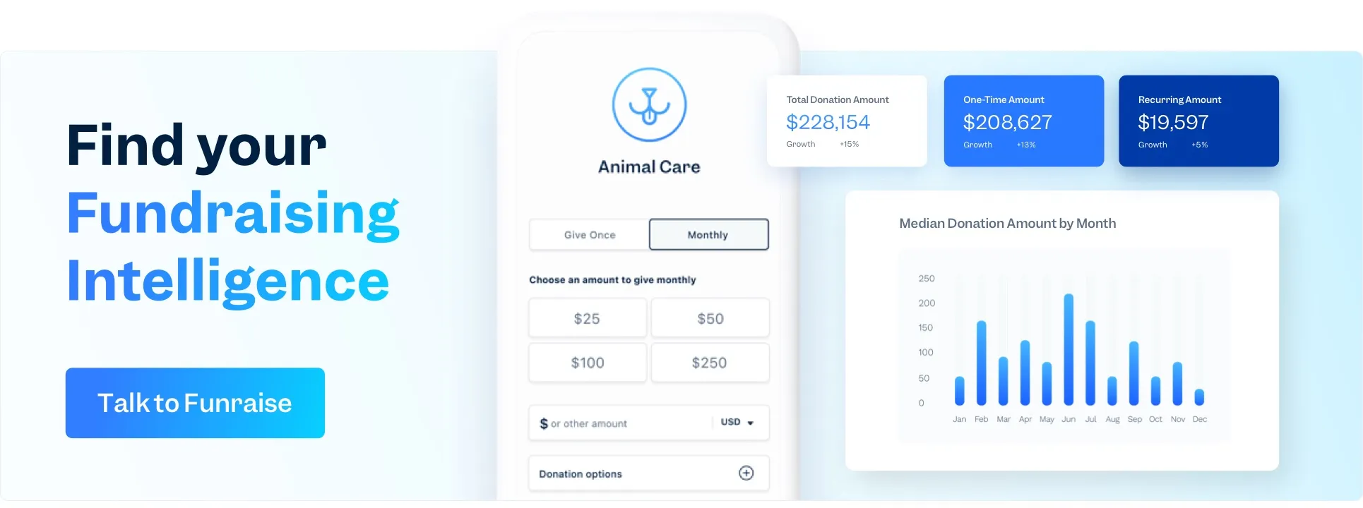
Start with Funraise's robust report library! Nonprofit leaders love great nonprofit dashboards that deliver clearly visible activity, including progress toward organizational goals, financial metrics, actionable insights, fundraising progress, and other visual tools. Funraise's Fundraising Intelligence offers these essential tools and more.
Build accountability dashboards by integrating your CRM and financial systems to auto-populate KPIs like average donation size and email click-through rates. Use drag-and-drop widgets to highlight progress toward goals. Ensure mobile access and role-based views for target audience like staff, board members, and grantors to foster data-driven culture.


.webp)
.webp)


.webp)
.webp)
.webp)
.webp)
.webp)