Donate Button Guide (With Free Donation Button Examples!)

April 4, 2022
9 minutes

In the world of nonprofit fundraising, we all have different aims and aspirations. But there’s one goal to rule them all—one purpose that brings us all together. And that’s getting more donations. “Sure,” you say with a smirk. “And how do I do that?” With a donate button, friend.

We are gathered here today to click through all the links and learn the why, where, and how of this little powerhouse. We’ve got oodles of information and shnoodles (maybe even poodles!) of donation button examples to inspire you. Let’s start pushing some buttons for good!

What is a donate button?

A donate button is a button on your website that's hosted by your fundraising platform, like Funraise. It directs interested donors straight to a secure donation form. Donation buttons should be easy to read and large enough to grab a viewer’s attention.  

With your donation button, you can redirect donors to a separate, secure donation page, or you can embed a pop-up donation form that, uh, pops up, for lack of a better phrase. While most donate buttons say “donate now,” you can choose any CTA (that’s Call To Action) you want. Direct donors to a specific fund or sign them up for recurring donations.

Benefits of using a donation button on your website

The real question is, why wouldn’t you use a donation button on your website? Unless you have koumpounophobia, which is a fear of buttons. And actually, that’s a fear of buttons on clothing, so … you should still add a donation button to your website. Because there are so. Many. Benefits. Let’s list them out. You’ll be adding that button to your arsenal of donation tools in no time!

It's so easy.

A donation button removes barriers to accepting donations. Think of it as one-stop shopping, except it’s one-stop donating. Consider the one-click buy option on Amazon: just tap one little button and it automatically charges, ships, and confirms your order.

It's basically free.

If you’re using a nonprofit CRM already, there’s likely to be no additional cost to add a donation button to your website. Nearly all web platforms have the option to add a simple button. With Funraise, for example, that integration comes at zero cost to you!

There's no competition.

Sure, various social media platforms have their own donation buttons, but there’s so much noise out there in the metaverse! With your very own donate-now button, it’s all about your nonprofit. The button directs donors to your donation page, so there's no muss, no fuss.

It's convenient for donors.

No more searching for a pen to write a check or poking around for the right page to make an online donation. With a donate button, donors click, fill in their info, and get on with their day.

It provides options.

A donation button saves your donors from agonizing over how to give. You can set suggested donation amounts in advance, or donors can give what they wish. They can easily make a recurring monthly donation, or make one in honor of a loved one.

Are you convinced yet? We hope so. Next up: where to put that miraculous button.

Where to put donate now buttons

Donate Now buttons need to be anywhere you’re making an ask. They should be front and center on your homepage, above the fold—not buried at the bottom or on an internal page. They should be in fundraising campaign outreach, marketing emails, on your blog, and on social media.

Still wondering if you should add donation buttons? Here’s the bottom line: If you’re thinking of it, just go ahead and do it.

On your homepage

A screenshot of The Foodbank Project with a white donation button in the middle of the homepage

Home is where the heart is, and it’s also where the donate-now button needs to be. Embed your donation button on your homepage, somewhere visible to everyone, to drive conversions. If you have a visual banner at the top, that’s great. You can also put it right smack in the middle of your hero image (that’s the big image pinned to your main page) so it’s impossible to miss. Many nonprofit organizations opt for the upper right-hand corner, too.

On the main menu

A screenshot of LINC's homepage with a green donate button

Since potential donors are likely exploring every nook and cranny of your website as they consider donating to you, your main menu is a prime spot for a donation button. We imagine their inner dialogue going like this: “Oh, just looking around, just exploring … What? A donation button? Well, if I must …”

In marketing and fundraising emails

An email from Rainforest Trust with a donate today button at the bottom

Donation buttons should be in pretty much all of your emails (the exception being a thank-you email for a recent donation). Sending out a donation request? Button. Providing an organizational update? Button. Sharing a success story? Button! Donors have read your story; now, they can easily be a part of it by clicking and giving. Donate buttons are also a great way to help meet your fundraising goals, so add them to all your campaign updates.

On your organization's Facebook page or Instagram page

A screenshot of Neighborhood House Portland's facebook donate button

Donors, like all of us, scroll through miles of Facebook pages or Instagram posts. Having a large donate button at the top of your Facebook page, or a slightly smaller one (that’s just how they format ‘em!) in your Instagram profile, makes it so easy for supporters to give if a certain post resonates with them. And while it doesn’t provide the branded experience of a donate button that links to your donation page, it does allow folks to give quickly without leaving Facebook. What a relief, right? Who knows what else is out there.

In your blog or press releases

A screenshot of charity: water's blog page with a donate button in the header

It’s always a good idea to have a (slightly more subtle) donate button anywhere that you’re telling a good story. Including a donate button on your main menu ensures it follows site visitors from article to article. Alternately, adding one beneath your blog posts or in a sidebar next to your press releases is a nice way to give potential donors some light donation encouragement.

Best practices for nonprofit donate buttons

A screenshot of DIGDEEP's World Water Day 2020 campaign site with donate buttons in yellow on a black background

When it comes to nonprofit donate buttons, simplicity is key, so every little detail matters. Splash it everywhere. Make it big and bold, so no one can miss it. Keep color in mind, align it with your brand, and craft a killer CTA—but keep that short and sweet.

Let’s dig into the details with some tips and tricks that will help you make your best donate button ever.

1. Consider donate button color

Your donate button should draw the eye, and that means using colors that stand out. The whole point of including a donation button is to make donating easy. If donors can’t find your button, the lil' fellow might as well not exist.

2. Go for brand/design consistency

That being said, stick with your brand. Hopefully, you have some brand guidelines to steer your online fundraising and, in turn, your button design. If not, stick with colors that are used across your current website, in marketing materials, and in your logo. Consistency is key!

3. Simplicity is best

Yes, we know, you’re an artiste, but use those mad graphic design skills on other projects. Your donate button should be clean and clear—no patterns, no fuss. And the same holds true for your text. Keep it clean and to the point. Your donation button is not the place to test out your novella. (But we do want to read it. Really!)

4. Think about your CTA

Again, that’s call to action. Essentially, your donate button is an action button—donors click it expecting it to do what it promises to do. You can urge them to “donate now” or “join the fight,” or you can get creative and choose an action specific to your cause. Just make sure it’s accurate.

5. Make it sticky

If you make your donation button sticky, it stays with the site user as they bop and scroll through the site—a constant reminder that they have the power to support your work.

Free donate buttons with Funraise

We’ve established that adding a donation button is easier than you think and will have a bigger impact than you expect. So, hopefully, you're ready to take the plunge and add donation buttons to your fundraising strategy! And that’s where Funraise sweeps in to save the day: we give you free tools to embed donation buttons and donation forms on your website so you can easily (and securely) collect donations.

In addition to providing totally free donate buttons for nonprofits, Funraise allows you to offer recurring donation frequencies and set payment options and suggested amounts. It also makes it easy for people to donate from their desktop, laptop, or mobile device. Basically, it’s a small package that packs a big punch! You’ll be able to capture donations from people on any device, sync your donation form with your integrated email list, and automatically send a donation confirmation receipt—all while collating donor data.

One more thing: While Funraise lets you make fabulous free donate buttons, you can also use a free graphic design software, like Canva, if you want to get a little fancy and make a custom donation button. And with that, our work here is done.

Now that you know you can create a donate button for free, you’re probably super stoked and ready to get started! Wait, is that skepticism on your face? “If I add a donation button for free, there must be a catch,” you think to yourself. Let’s explore those feelings …

Cost of adding a donations button: What’s the catch?

We promise: There's little to no cost to add a donations button to your website. Nearly all web platforms have the option to add a simple button, and with Funraise, that integration comes at zero cost to you!

The only real cost, then, is in waiting. The longer you wait to get your own donation button, the longer you're leaving potential donors in the dark. Your cause is worth transforming your digital fundraising, so hop to it—pronto.

The best donate buttons: examples

We’ve made our case. And now, we think you’re ready to have the greatest donate button around—the one that every kid is talking about on the playground. We’ve got you. Below, we’ll show you a smorgasbord of the best donate buttons, with donation links that are intuitive to use and easy on the eyes.

Cool donate buttons: examples

Let’s kick things off with a selection of exceptionally awesome and exceedingly cool donate buttons. These cool donation buttons stand out from the pack with their eye-catching colors, unique shapes, and smart placements.

1. Point Foundation’s neat donate button

A screenshot of Point Foundation's cool donate button. It's round, orange, and in the header.
What’s good

Point Foundation’s donate button is impossible to miss. It’s big; it’s colorful; it’s fun. But it still feels unintrusive because it’s clearly part of the nonprofit organization’s brand.

Could it be better?

We’re all about clear call-to-actions, and having “donate” right above “contribute” is a bit confusing, as the terms are quite similar. And the homepage overflows with fascinating impact statements, but because the button’s not sticky, it’s gone as soon as you scroll down. Finally, when you click, you need to select “donate” one more time to actually make that donation. The best fundraising strategy is to streamline the donation process so donors can give with a click.

2. Opal Creek’s spiffy donate button

A screenshot of Opal Creek's cool donate button in the header. It looks like an orange pennant.
What’s good

Opal Creek Ancient Forest Center makes their donate button impossible to miss, with a bold color and a stand-out shape. It’s not intrusive, but it makes an impact. We also love that it changes color when you hover over it, encouraging interaction.

Could it be better?

The button’s fab, but when you click it, you have to scroll and scroll, then click another “donate” button to actually donate. Plus, you have to sort through multiple donation options, with separate buttons for one-time gifts, recurring giving, workplace giving, and more. It’s a lot of work for donors. Instead, this cool button should pop up a simple donation form, where donors can give with a click.

3. Know Your Rights Camp’s awesome donate buttons

A screenshot of Know Your Rights Camp's homepage with a cool donate button. The donate button is a red capsule shape on a black background.
What’s good

Know Your Rights Camp’s website is mission-driven and future-focused. The red buttons against the black-and-white background, which is a video, make a powerful impact. There’s no way you can miss them. When you click one of the donate buttons, the site pops up a donation form that reiterates their mission and provides suggested donation options.

Could it be better?

We’re all for a big, bold donate button—but three buttons on one screen is a lot! It feels a little much, plus they all take you to the same donation form. The heart on the left-hand button feels a bit out of place with the aesthetic, too.

Cute donate buttons: examples

So, you’ve got your heart set on a donate button that’s cute as a button! Wait, but it’s already a button. So … huh. Anyway, here are a few cute donate buttons for plenty of adorable donation inspiration.

1. HERoines’ sweet donation button

A screenshot of HERoines' homepage with a cute donate button on the right hand side.
What’s good

We love this cute donate button aesthetically—it’s creative, it’s unique, and it’s quirky without being kitschy. That heart icon is modern and distinctive. Plus, the button’s sticky, so as you scroll down, it’s always right there, ready for a quick click if the urge strikes!

Could it be better?

Because the central image is so vivid, the donate button blends into the background a bit, and site visitors could miss it. Additionally, the pale text color means that as you scroll, it gets lost against sections of the homepage that have a light background.

2. Paper Airplanes’ adorbs donate button

A screenshot of Paper Airplanes' homepage with a cute donate button in pink
What’s good

This nonprofit’s website feels simple, but we love the rounded edges and soft font of Paper Airlines’ donate button. Putting it right next to their colorful, sweet logo (with its catchy slogan!) makes you want to take action and make a change. The donation form is wonderful, with each donation amount connected with a specific impact. We also love the “I want to fundraise for this” option on the form—way to pump donors up for some peer-to-peer fundraising!

Could it be better?

Maybe we’re perfectionists, but the button location feels a little off—we’d rather have it aligned with the other menu options or in its own space. Having it so close to “Tutor or Volunteer” also means that we kept hovering over that option instead. It could also be a teensy bit bigger.

3. JDC’s cutie-patootie donate button

A screenshot of JDC's cute donate button on their homepage. It's a red donate button with a heart.
What’s good

Listen, pink + hearts just ups the cute-button factor! JDC’s donate button is large and in charge. The pink color makes it pop, and the heart feels welcoming. And we heart that the pink color doesn’t feel totally out of left field because there’s a sliver of that same pink in their lovely logo.

Could it be better?

The button goes right to a donation page, but you have to scroll through a half-dozen paragraphs of text to actually enter your information. We already clicked, so we already want to donate! While your donation form is a great spot to reiterate your mission, you only need a sentence or two. Once folks have clicked your donation button, you don’t need to do a lot of convincing.

Red donate button examples

Contrasting, bright colors make a donation button pop. And one of the colors that stands out the most is fire-engine red. A lot of nonprofits already use red on various fundraising pages because it denotes urgency. A red donate button is sure to do the same.

1. Multiple Sclerosis Association of America’s red donate button

A screenshot of MSAA's homepage with a big red donate button.
What’s good

MSAA’s donate button is impossible to miss, but the red color is also included in their logo, so it’s not out of place. And we love the straightforward donation form. When you click the donate button, it goes straight to a clear-cut form, with suggested donation amounts and one-click options to be a recurring donor or make a gift in memory of someone. Below that, you can pay by credit card or PayPal. There’s even a field to search for whether your employer makes matching gifts.

Could it be better?

We’re not in love with the stacked call-to-actions—it feels a little cluttered—but besides that, this is pretty great.

2. Everytown for Gun Safety’s red donate button

A screenshot of Everytown for Gun Safety's homepage with a bold red donate button in the top right hand corner
What’s good

Everytown for Gun Safety’s red donate button really stands out—both due to its position and its color. At the same time, it feels on brand because the same color red is in their logo. Additionally, because ending gun violence feels so urgent, the red feels tonally appropriate. The donation form, too, is clean and to the point. There are clear buttons for GPay, PayPal, and credit card, as well as all the expected giving options. And we like that the impact statement is next to the donation form—no scrolling needed.

Could it be better?

The donation form is great, but we wish there were a couple of additional options. There’s no way to give a gift in honor of someone, and there’s no search for matching gifts.

Blue donate button examples

Who doesn’t love blue? No one, because it’s the best color. And even if you don’t agree with us, you probably like the ocean and sky and blueberries. Blue, in many ways, is the opposite of red. It brings about feelings of peace and tranquility—and that can be useful for your fundraising strategy. Check out these examples and see how you feel. A blue donate button might be your key to chilled-out, ready-to-give donors.

1. 350.org’s blue donate button

A screenshot of 350.org's homepage with blue donate button in the header.
What’s good

350.org’s blue donate button echoes the color of their logo and the background color behind their mission, creating a nice sense of balance and cohesiveness for their page. The blue feels especially appropriate for an environmental organization. On the donation form, everything’s clear-cut and easy. We like the option to give $3.50, $35, or $350 as a nod to the organization—it lends a little spice to the usual donation amounts.

Could it be better?

The hero image changes, and the donation button pops more against some images than others. It gets a bit lost in the more colorful ones, though the images themselves are powerful. Also, we’d make that top menu sticky, so that you keep seeing the donation button as you scroll down.

2. P.S. Arts’ blue donate button

A screenshot of P.S. Arts' homepage with a blue donate button
What’s good

P.S. Arts’ colorful donate button is on brand, sticky, and user-friendly. Click to go straight to a donation form or use the handy drop-down menu to see all the donation options. And their donation form lays it all out there as succinctly as possible: gift amounts, recurring gifts, and tribute gifts as well as single-click options to “donate via PayPal here” and “see if your employer will match your donation!”

Could it be better?

We gotta say, this is a great donate button and a great donation experience, top to bottom.

Donate here button examples

While there’s something to be said for going with a simple, standard, successful donation button, it’s natural to want to stand out a little bit. And if you’ve got the color, the placement, and the giving experience down, what else is there to change up but the wording? One CTA to try is “Donate Here”. A donate here button confirms to the donor that they’re in the right place, and these examples confirm that bringing the horse to water is half the battle.

1. DFRC’s dynamite donate here button

A screenshot of DFRC's donate page with a yellow donate here button
What’s good

DFRC has their donate here button on a pretty busy page, and yet, it still stands out. The size, color, and contrast of the button ensures that potential supporters know that they can donate money right then if the other ways to help feel overwhelming.

Could it be better?

The placement! Dang, it’s a good thing that this is a big, bold button, because it’s almost lost on the page. If DFRC moved it to the header or to the middle of the page, we think that it might just inspire more clicks.

2. St. Francis High School’s heartwarming donate button

A screenshot of a website with a red heart donate here button
What’s good

We almost put this in the section with cute donation buttons because holy moly, is this the definition of adorbs or what? St. Francis nailed it with a button that manages to make our hearts flutter before we even hand over our heart-earned dollars.

Could it be better?

Why not share this button all over the website? It’s a shame that it’s only visible on the donation page.

Give now button examples

Where do we wanna give? Here! When do we wanna do it? Now! If you want your donors to repeat this chant, you need a give button with an emphasis on the “now.” Fortuitously, we’ve got a couple of examples for you.

1. Oregon Humane Society’s give now button

The Oregon Humane Society's website with a picture of a kitten and a give now button
What’s good

This sweet give-now pop-up donation button does a great job of convincing us that we need to give right away. After all, it’s for Jake! And who can resist that cute face? The $10,000 incentive is a great way to create urgency, too. Why wait if donating ASAP means getting some extra funds? When you click, you go straight to a clean donation form.

Could it be better?

The “Unlock $10,000” is a bit mysterious. Is it a matching gift? Or do we get $10,000? That’d be nice … Once you click, they do explain that they need 100 new donors to get the additional funds.

2. World Housing’s donate now button

A screenshot of World Housing's website with a give now button that says donate now
What’s good

The “donate now” button really pops against World Housing’s powerful hero image, emphasizing the immediate need for safe housing. And the donation form itself is one of the cleanest we’ve seen—there’s no fat left to trim!

Could it be better?

Their mission is powerful, but it’s difficult to read when overlaid on their logo, which also uses white text. Additionally, “learn more” is larger than “donate now,” and the two buttons are the same shape and color. That muddles the message a bit in terms of which CTA is the priority.

Small donate button examples

Good things come in small packages, so it stands to reason that your donate button doesn’t have to take up half your page to make an impact. If you’re considering small donate buttons, the examples below will let you take some baby steps towards button inspiration.

1. Bienestar’s orange donate button

A screenshot of Bienestar's website with a small donate button
What’s good

This donate button is petite but noticeable. The bright orange color and location makes it impossible to miss, but it still feels on brand. We also love the bright sun just underneath the main menu—the whole page feels hopeful.

Could it be better?

This is a great example of a small button! The donation form itself is solid but allows donors to choose a campaign, then only has one option: “general.” But that’s a small nit to pick.

2. Thorn’s mission-driven donate button

A screenshot of Thorn's homepage with a small donate button and a small donate now button
What’s good

This button’s small, but it has a big impact—and there’s another, bigger, bolder button on the hero image. It doesn’t feel like too much because there’s so much white space and the central image is so powerful. Thorn’s work is heavy, but their website is doing a great job of infusing it with hope and empowering supporters.

Could it be better?

This button duo is a perfect pair. And when you click either one, the site reiterates Thorn’s impactful message—but you also have to click again! The “Be a builder” CTA followed by a separate “Join now” CTA to be a builder is confusing, too. One CTA for each action is our mantra.

Donate button on website: final points

You’re armed with an encyclopedia of donation button knowledge. Now, it’s time to make your very own donate button and get fundraising. But if you need a quick refresher, here’s one that’s right on the button:

  • A donate button provides an efficient way for supporters to give directly to your organization.
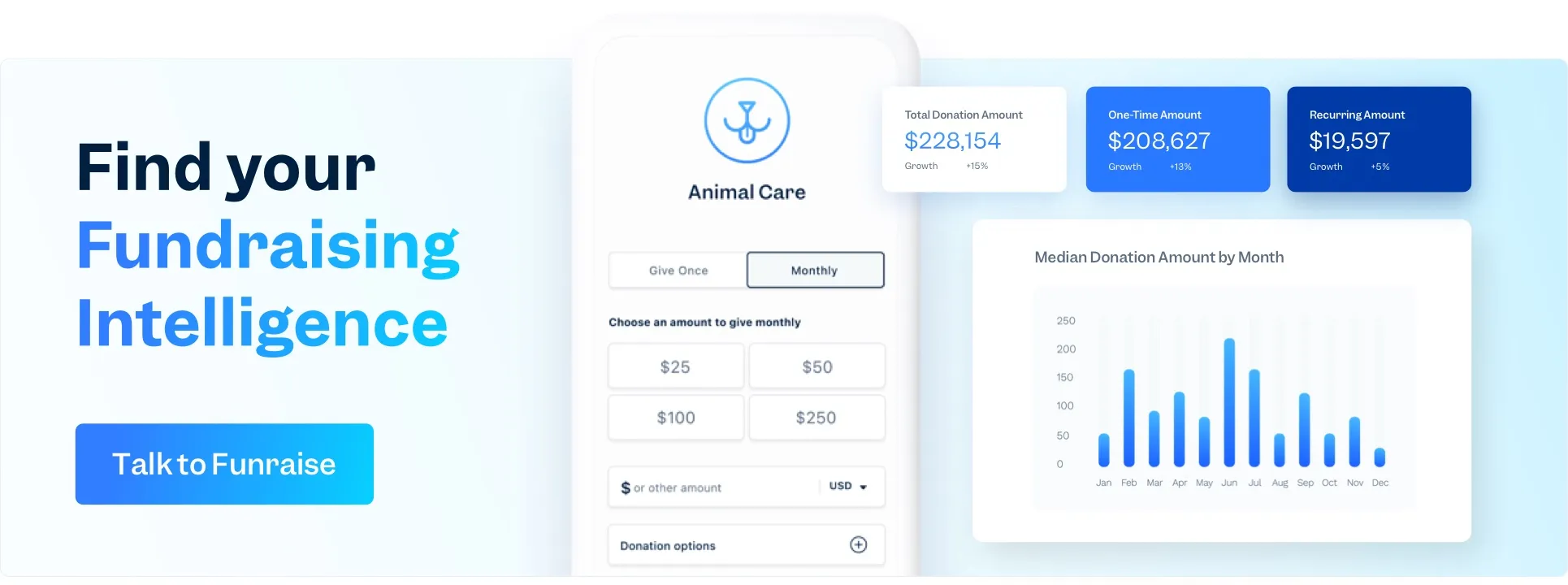
  • The donate button on your website should open a pop-up donation form or redirect users to a separate, secure donation page. This form should be simple and straightforward so donors don’t get confused and leave.
  • Provide options to encourage your donors to give more, such as becoming a recurring donor, making an honorary gift, or checking for a company match.
  • The best donate buttons are impossible to miss, so try contrasting colors and bold fonts to make them pop.
  • Popular CTAs (CTA = call to action) include “donate now,” “give today,” and “get involved,” but you can experiment to figure out what works best for your organization. Generally, specificity helps, so consider pairing a short CTA with a mission statement.

FAQs: online giving button

Do donate buttons work?

Donate buttons let donors contribute directly to your cause with one click. They’re a great way to drive conversions and emphasize your nonprofit’s priorities for site visitors. Because donate buttons make giving so easy and offer multiple giving options, they’re a vital fundraising tool for any nonprofit organization.

Should I have a donate button on my website?

All signs point to yes! Adding a donate button to your nonprofit website drives conversions by removing barriers to accepting donations. Just one click and you can make a donation. That means they’re convenient for donors and efficient for you. Plus, they cost you nothing.

Do people donate on websites?

More than ever, people make their donations on websites. While many donors still give by check or call to make a payment by credit card, online giving continues to grow year over year. Because of this, you should have a branded, modern website. Adding a donate button will certainly help!

Download
Start For Free